This photo has been sitting on my desk with these Heidi Swapp September Skies papers for a little under a year - I had planned to scrap them during the 4th of July Cybercrop last year but it just did not happen. I love the colours and they fit in with the moodboard embracing the peach and pinks.
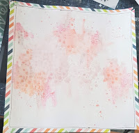
Firstly I started with a base of white cardstock that I trimmed a little of the edges to make the page smaller than the standard 12x12 layout. I then started to add a lot of different water colours in tones of pink, peach & orange. I love how the mica and sparkle come through on the Lindy's products to add more warmth with pizzazz. I got a bit crazy in the end and the next step had to happen.
I have used - Lindy's Cocklebells Coral, Alpine Ice Rose, Oktoberfest Orange. Brusho Gamboge & Vermillion.
I have then painted over the whole project with white gesso. I was unhappy with some of the formations and placements of my watercolours - it did not evolve how I had envisioned. After painting with gesso I placed a Kaisercraft floral stencil over and using a wet cloth and then paper towel I removed the gesso leaving the resist under the stencil.
I cut one inch strips of Heidi Swapp September Skies Light Spectrum and taped them around the outer border then I sewed them to the page.
After working out placement of the photo I added some stamping elements by using the Art by Marlene stamp set Mandala Tapestry. The photo stack was put together by using some Gold Tissue from Kylie - love using up my packaging when my parcels arrive, HS September Skies Stargazer and Alpine Rose printed cardstock. After placement of the photo I decided to add a little more depth and re-use the stencil with Liquitex Modelling paste.
I have added some paper flowers and Prima leaves to the page and embellished with Tim Holtz Clippings stickers. I typed my journalling before adding it and using a Fudeball pen to underline. The title was created using some old stock of HS chipboard alphas. I have added a flair and a little more stamping using the Kaisercraft tiny dot stamp.
I added a few watercolour splatters to the page to help finish it off. I'm very happy with how this layout has turned out. It has been a while since I have incorporated so many printed papers and flowers as I don't normally work with flowers.
I hope you have enjoyed my take on the sketch and happy creating
tracey


No comments:
Post a Comment