Showing posts with label Gesso. Show all posts

Monday, 3 November 2025

November Newsletter: Gratitude & Reflection

 November is here — and we’re feeling all the creative gratitude

After the incredible energy of the ScrappingClearly Artistic Anarchy Retreat, we’re taking a moment to pause, reflect, and celebrate everything our amazing community has created and shared. This month’s newsletter is packed with inspiration to help you capture those thankful moments in your own creative way.

Inside you’ll find:

  • Journalling ideas & prompts to inspire reflection

  • Product spotlights on journals, pens, tags & stamps

  • Tips for mixing handwriting with printed journalling

  • Curative Collective Artist Highlight

  • New products 

It’s a month to slow down, create with purpose, and appreciate the stories that matter most.

Follow the link to our Scrappingclearly Share & Inspire Facebook page to read the newsletter in its entirety 


Wednesday, 15 October 2025

OCTOBER NEWSLETTER 2025 - SPOOKY & GRUNGE

 If You Haven’t Seen It Yet – Our October Newsletter is Here!

It’s packed with inspiration and tips to spark your creativity! Inside, you’ll find:

  • Creative Challenges – Join our Moodboard, Sketch, and Weekly ATC Prompt Challenges.

  • NEW Luckyfindings Halloween Release – Make your layouts dynamic, eye-catching, and truly your own with our spooky, creative Halloween designs.

  • Guide to using pastels – Fresh ideas to elevate your layouts and mixed media projects.

  • Storage Wars  – See what hints Amanda has for you in her informative posts.

Follow the link to our Scrappingclearly Share & Inspire Facebook page to read the newsletter in its entirety and get inspired for your next project!


Tuesday, 30 September 2025

PRODUCT COMPARISON - GESSO

White vs. Clear vs. Black Gesso

If you love mixed media, you already know gesso is a must-have in your stash. But with so many options  - white, clear and black, it can be tricky to know which one to reach for. Let’s break down the differences and when to use each.


White Gesso

Best for: Classic base coating, priming, bright backgrounds.
  • Creates a smooth, opaque surface that covers patterned paper, chipboard, or canvas.

  • Brightens colours layered on top—perfect when you want paints, inks, or pastels to really pop.

  • Great “oops fixer” if you need to tone down busy paper before adding layers.


 Clear Gesso


Best for:
Preserving patterns or working with slick surfaces.

  • Transparent primer that lets the original design (like patterned paper, collage, or photos) show through.

  • Adds “tooth” so your mediums grip better—fantastic for journaling, watercolours, or over glossy papers.

  • Ideal when you don’t want to lose detail but still need a workable base.


Black Gesso

Best for: Dramatic, moody, or grunge-inspired projects.

  • Gives a deep, matte black base that makes metallics, neon paints, and bright colours glow.

  • Creates instant contrast—amazing for Halloween, industrial, or night-sky looks.

  • Can transform plain chipboard or wood into bold, ready-to-layer embellishments.


 Quick Tip:

Think of gesso like a stage:

  • White sets a fresh, bright scene.

  • Clear keeps the background in the spotlight.

  • Black adds drama and intensity.

Want to try them all? You’ll find white, clear and black gesso in the Scrappingclearly store. Perfect for experimenting with new looks this October. Stock up today!


Thursday, 14 April 2022

'Take the Scenic Route' by Emma Zappone

 Hi there. 
Today I am sharing a very quick and easy Art Journal page with you that I also made a video of.
I based this page on this months mood/sketch colours. 


This page was created in my 5x7 Art by Marlene journal. I prepped my page with white gesso first as it had some marks and paint from a previous page.
Then I used Finnabair stencil Mind Games as an interest on the base with modeling paste.


Once the paste was dry, I started adding colour with Distress Crayons. I applied the colour like a watercolour over the background. making sure the colours met but didn't mix.
Once these were dry, I etched a black border and drew some loose lines amongst the pattern of the paste. This added a little more depth to the background. I also added a little light stamping using Framework Elements stamp by Aall & Create.


Popping that aside for a minute, I grabbed a couple of Naturalist Rub-ons by 49 and Market. I transferred one of the bright butterflies onto a piece of cardstock and then fussy cut it out. I also used some of the stitching lines amongst my drawn border. 


These colours work so nicely together. The quote used is from Tim Holtz Idea-ology quote chips and finally finished it all off with some black & white ink flick.

Please enjoy this page coming to life here....


Have a great week everyone and will see you again soon.
Em xx


Thursday, 24 March 2022

Entomology Tag by Emma Zappone

Hello everyone.
Today I share a video and a tag created using a mix of products you can find in Kylie's shop.
It focus's on Stamperia product, resin and texture.


This tag is approx 5"x7" and created on packing board. Nice & Sturdy.
It is then primed with some white gesso to get it ready for all the paint to come.
I then chose a couple of earthy colours for my background from Art By Marlene in Tuscan & Tobacco.
And then a little watercolour concentrate from Prima.


You can see how I added the colours in the video. Then I added some texture with some modeling paste. I grabbed a sheet of the Stamperia collectables paper and tore what I needed and then blended it into the tag background with more paint and some rubons. 


Once the background was complete, I chose what I needed to decorate the front. I knew I wanted to use butterflies especially since I had this beautiful resin butterfly from Kylie. So I made this my centre focus. I painted it in a couple of Stamperia colour gels, Gold Dew & Star Blue.


I fussy cut some of the butterflies from the same collectables paper pad and then to make it look like one of those butterfly display boxes you see at the museum, stamped with Tim Holtz Field Notes to add the Fig.1 ect next to each butterfly.


I flicked with remaining ink and a few matching Prima watercolour concentrates.

I hope you enjoy the process video which shows how it all comes together.


Stay safe and Happy Crafting.
Em xx


Sunday, 2 January 2022

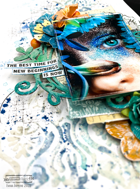
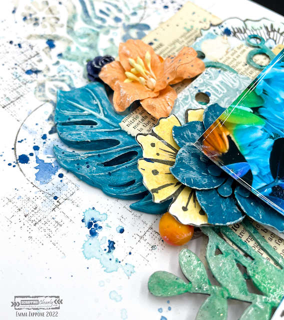
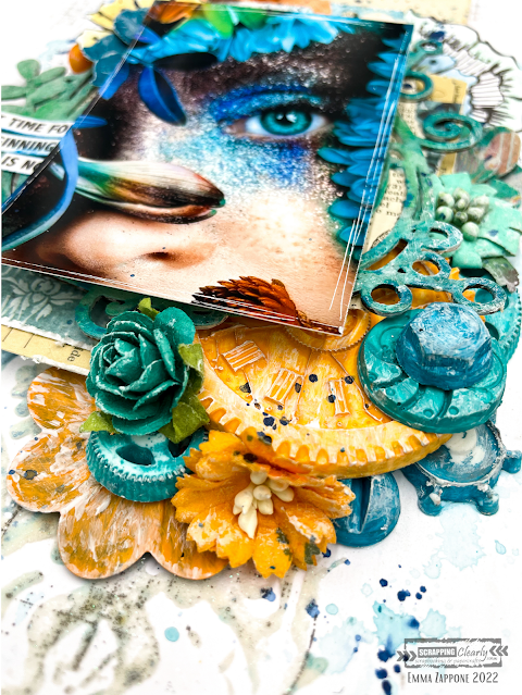
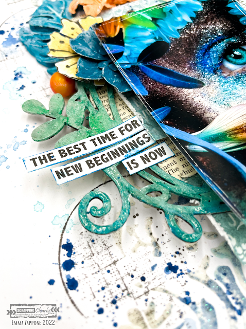
New Beginnings - with Emma Zappone

 Welcome to 2022!!
ScrappingClearly has got some awesome things planned for everyone this year.
And today I'm sharing with you an A4 layout and a Video that has been created using inspiration from the absolutely awesome NEW mood/sketch for January. The colours scream summer and fun!
Here is what I was inspired to create......


Here is the mood/sketch...


Super cool right???
I decided to focus on the mood part of this board, and save the sketch for later in the month.

I used lots of products in my stash but also available in the SC shop. Firstly the stencil I used is a Finnabair stencil Oriental wall used with snowflake paste. Soft and glittery which was a great base to start with. Then I smooshed colour. I chose to use 2 colours for the background work. First is an Izink pigment in celestial and then a Distress crayon in Peacock Feathers.
These worked so well in with the paste.


Ok, so I LOVE moulds and this page incorporates plenty. I used a variety of different ones, but love the big palm leaf and of course the machine parts one. These are painted with Dylusion paints in a mix of Squeezed orange & Polished Jade. The metal Finnabair mechanical flowers were primed with white gesso first and then painted with the coloured acrylic also. 


I added a little stamping onto the background to add more layers using the Tim Holtz Glitch1 set. It's grungy but goes with just about everything. I love the texture it brings.


The chipboard frame is one I have in my stash and I primed it with white gesso first and then with complimentary Distress crayons 'coloured' it in. Then sprayed with water and painted out the crayon, which created this cool blended watercolour effect. Then it was clear embossed.


In the video you will see me use a flower stamp by Art by Marlene and then coloured with more Distress crayons and then cut out to help build my layers. I absolutely love the dimension of this layout.
The papers that mat my image are what I have in my stash, and I love adding book paper for that slight reference to vintage style that I love.

I hope you are inspired by this project and the amazing board that is available for you to play with NOW!
I hope you enjoy watching this project coming together too...watch now with a cuppa....


I will see you all very soon.
Stay crafty friends, Emma. xx


Sunday, 8 August 2021

My Darling with Emma Zappone

Happy Sunday all! Emma here with you today sharing a page inspired by this months glorious moodboard. It has the warmest shades of mauve, purple and grape. Colours that usually would have me running, but this time I decided to really embrace them and make them my own.

Here is the moodboard.....


To achieve the different shades of purple, I used a variety of different products. But lets start from the base sheet up. I primed by paper with a clear gesso and allowed to dry. Then with a couple of different stencils added a white crackle paste and again allowed to dry. Once dry I then used a Distress Crayon - seedless preserves and a touch of Dylusions crushed grape ink to create a dramatic effect on the crackle paste.


To add a little warmth I watered down a small amount of Art Alchemy Metallique romance pink acrylic  with a fine brush, dotted in amongst the other shades of purple.


I used a number of scrap pieces of paper from all sorts of brands to achieve my layers behind my image. The chipboard is painted with the Romance pink acrylic, I primed all my resin pieces with black gesso and then brushed Prima waxes once dry. these were a combination of Heather Hills and Amethyst magic. It created such an awesome finish. 


Once all my embellishments and flowers were in place I dry brushed a little white gesso over a lot of the elements, this allowed me to then add a touch of wax over the art pebbles and other embellishments.


Lastly a few Finnabair micro beads and Prima pearls to add a soft touch. I watered down a little of the Distress crayon used on the background and flicked this around my layout to tie it all together.


I hope this page inspires you a little to try a colour that may not be your first choice or one that you play with often, but that's what makes a challenge like this so much fun.

Catch you all again soon, Em xx 


Friday, 16 July 2021

Tab Tag Booklet with Belinda Spencer

 Hey Scrapping Clearly fans!

It's Belinda here today with a late post! I have a cute little booklet to share with you featuring the Tab Tags by Studio Light Art By Marlene Essentials and lots of other fabulous goodies from the store.


I grabbed 6 tags from the pad and proceeded to colour them using Prima Art Philosophy Concentrated Watercolours. I spritzed one tag to start with using quite a lot of water and then dropped the watercolour onto the surface. It's kind of mesmerizing watching the watercolour bloom and spread. I added three different colours to the first tag. Then, because the tag was so wet, I placed another tag on top of it to colour that one too. 


There was quite a lot of excess watercolour that squeezed out the sides so I used some book paper to swipe it up and made myself some instant collage fodder.


Next I grabbed some of the awesome Dina Wakley Stickyback Canvas Tape. I cut three lengths, removed the backing and stuck them to some plastic packaging. I spritzed them with water and added the same watercolours. I left them to dry in a sunny spot. These are what I used to bind my tag book together.


Once completely dry, I stamped and stencilled the tape. I used Ranger Jet Black Archival Ink for the stamping and a heavy weight gesso for the stencilling.


Next, I added some stencilling to the tags using the same gesso and stencils.


Here is the cover of my tag booklet. I added some collage using torn pieces of the collage fodder I created earlier and also torn pieces of Art By Marlene Collage Paper. I also collaged on a cute girl from the Art By Marlene Paper Elements Books (Mint and Lime). I used Dina Wakley Ultra Thick Gel Medium for the glue. I also added some stamping and doodling. I used a Stabilo watersoluble pencil to scribble around the girl and then activated with a wet paintbrush to emphasize her and set her apart from the background.


I used pretty much the same techniques for all of the pages using different cute die cuts from the Paper Elements books. I used Posca Pens, acrylic paint and Lyra Watercolour Crayons to add detail to the backgrounds. The quote stickers are from the Studio Light Jenine's Mindful Art Collection Time To Relax Stickers.


Products used:
STUDIO LIGHT Art By Marlene:
- Essentials Tab Tags
- Collage Paper
- Paper Elements Lime Collection
- Paper Elements Mint Collection
- Clear Stamps Mandala Tapestry
- Marlene's World Clear Stamp Sweet Birdie
STUDIO LIGHT Jenine's Mindful Art Collection Time To Relax Stickers
VICKI BOUTIN Clear Stamps Colour Study
PRIMA Art Philosophy Concentrated Watercolour:
- Blush
- Bright Pink
- Marigold
- Peacock
- Truth
RANGER Archival Ink Jet Black
gesso
DINA WAKLEY 
- Ultra Thick Gel Medium
- Stickyback Canvas Tape
UNI Posca Pens

Thanks for stopping by the blog today! I hope you are inspired to have a play over the weekend with your Scrapping Clearly goodies too.
Cheers
Belinda


Friday, 21 May 2021

Happy with Belinda Spencer

 Hello Scrapping Clearly fans!

It's Belinda here with you today to share my latest layout using lots of gorgeous product from the Scrapping Clearly store.


For this layout I began by cropping my patterned paper and cardstock to my preferred size for layouts. I cropped the Studio Calico Seven Paper to 8 1/2" x 11 3/4" and the Bazzill Marshmallow Heavy Weight cardstock to 8 1/4" x 11 1/2". I used my W R Memory Keepers Typecast Typewriter to add a bunch of stuff that I am currently loving and that makes me feel happy. I then stuck this piece onto the patterned paper.

Next I mixed some Vibrant Turquoise Dylusions Paint with heavy white gesso and spread over my layout with a palette knife. I watered some down and flicked it over the page with a paintbrush too.


I added some sweet stars using a Heidi Swapp stencil and a Pigma Micron 04 Pen. I tore some pretty flowers and a leafy stem from the Tim Holtz Botanical Collage Paper and added to the page with some matte gel medium.


I created a stack of layers next to sit my photo on. I used some Heidi Swapp Dreamy patterned paper from the 6x6 Paper Pad as well as die cut papers, doilies, a tag and a chipboard frame. I added my title and some embellishments as well as a sticker quote to finish.

'Happy'


Products used:

BAZZILL Heavy Weight Cardstock Marshmallow
STUDIO CALICO Seven Paper Goldie 002
HEIDI SWAPP:
- 6x6 Paper Pad Dreamy
- 6x6 Die Cut Papers
- Paper Doilies
- Chipboard Frames
- Chipboard Stickers
- Tags
TIM HOLTZ Idea-ology Collage Paper Botanical
RANGER Dylusions Paint Vibrant Turquoise
STUDIO LIGHT Jenine's Mindful Art Collection Stickers
PIGMA Micron 04
UNI Posca Pen Black 0.7mm
gesso
matte gel medium

Thanks so much for stopping by the blog today. Have a great weekend and I hope you manage to fit in some scrapping time.

Cheers
Belinda