Showing posts with label scrapbooking. Show all posts

Thursday, 17 September 2026

What Could You Create If You Didn't Need to Get It Right?

 What would you make if you knew you couldn't get it wrong?

It's an interesting question.

Because somewhere along the way, creativity can become less about exploring and more about getting things right. We look at beautiful projects, carefully constructed pages and perfectly finished pieces and wonder how we could make ours look the same.

But perhaps creativity was never meant to work that way.

Perhaps the magic is in the experimenting.

The unexpected colour combination. The piece of paper that doesn't quite seem to belong. The layer that looked better before you added the next one. The idea that changed completely halfway through.

And sometimes, the things we initially think are mistakes are exactly what make a piece interesting.

Start Without Knowing the Ending

There is something wonderfully freeing about beginning a project without knowing exactly where it will finish.

Choose a few papers >>> Pick a colour  >>> Add an image >>> Make a mark >>> Layer something over it >>> Move it around >>> Take it away >>>  Try again.

You don't need to have the finished project sitting perfectly formed in your head before you begin. You can allow the project to reveal itself as you work.

One decision leads to another.

One layer suggests the next.

A scrap of paper might change the direction completely.

And suddenly, you aren't following a plan anymore — you're responding to what is happening in front of you.

That is creativity too.


Give Yourself Permission to Experiment

Maybe this month is the time to use the supplies you've been saving for the "right" project.

The point isn't to deliberately make something imperfect.

The point is to give yourself enough freedom to discover something you wouldn't have found if you were trying too hard to make everything perfect.

Your Creative Space Doesn't Need to Be Perfect Either

And perhaps this applies to more than the project itself. Your creative space doesn't have to be perfectly organised before you begin. You don't need an empty desk. You don't need every supply neatly put away. You don't even need a completely free afternoon.

Sometimes creativity happens in the fifteen minutes you have before dinner. Sometimes it happens amongst a pile of scraps and half-used papers.

What matters is making a little room for it.  A little room to wonder.   A little room to experiment.

A little room to say, I wonder what would happen if I tried this?

So, What Could You Create?

This September, as we embrace A Season of Possibility, perhaps the invitation is a simple one:

Don't begin with the question, How do I make this right?

Begin with:

What could happen if I just started?


  • Pull something from your stash.
  • Choose something you love.
  • Choose something you're not sure about.
  • Make a mark.
  • Try a layer.
  • Change your mind.
  • Follow the idea wherever it leads.

Because creativity isn't always about knowing exactly what you're doing.

Sometimes it is about being curious enough to find out.

Tuesday, 26 May 2026

MAY NEWSLETTER

 The May Scrappingclearly Newsletter has arrived… and this issue is all about celebrating a wonderfully busy month of creativity, community and curious adventures. 

Inside we’re taking a look back at our magical Down the Rabbit Hole Retreat, showcasing the beautiful new Alice-inspired Luckyfindings Fragments released during the weekend, and sharing a little peek at the upcoming Vivid & Vintage Retreat.

We’re also celebrating World Scrapbooking Day, reminding everyone to keep sharing their gorgeous creations in the Scrappingclearly Share & Inspire Facebook group, and shining a spotlight on this month’s vibrant Spectrum Stories kit.

So grab a cuppa and settle in for a little recap of a month absolutely filled to the brim with arty goodness, friendship and creative fun. 

Click on May’s installment of creative goodness below to download your copy of this months newsletter


Saturday, 18 April 2026

Using Tags & Journaling Spots in Mixed Media & Scrapbooking


Tags and journaling spots are one of the most versatile and essential elements in scrapbooking, junk journaling, and mixed media art. Whether you’re building layered scrapbook pages, creating mini albums, or designing expressive layouts, they provide structure, texture, and storytelling space in a way few other products can.

They are a place to write, hide, layer, and reveal — or simply allow design elements to breathe within your composition.

At Scrapping Clearly, the range of tags, die-cuts, journaling pieces, and Luckyfindings designs from leading creative brands makes it easy to build depth, detail, and storytelling into every project.

Why Tags Matter (and How to Use Them)

Tags are more than embellishments — they are functional storytelling elements that help shape your page.

They can:

  • Add journaling space
  • Create focal points
  • Build interactive pockets
  • Anchor embellishment clusters
  • Introduce texture without bulk

With a little mixed media layering, a simple tag can become so much more. It can be a focal feature, a hidden journaling pocket, a cluster foundation, a textured collage surface, or even the starting point of a mini artwork.
Add paint, stamping, collage papers, stitching, and layered ephemera, and even the simplest tag becomes something richly dimensional.
Often, it’s the smallest element that carries the most story.
Once you start thinking of tags as storytelling tools rather than just embellishments, everything opens up. The base you choose can completely change how a page develops — whether you prefer raw mixed media layers, delicate detailing, or bold expressive clusters. This is where inspiration turns into creation.


      Curative Collective Team member Lisa Oxley

Tag & Journaling Spot Inspiration – Scrapping Clearly

At Scrapping Clearly, you’ll find a wide range of tags, journaling spots, die-cuts, and creative bases designed to suit every style. From raw surfaces ready for paint and ink through to decorative pieces and Luckyfindings designs, everything is designed to help you build layered, meaningful compositions.

Let’s break it down so you can quickly find what suits your creative process.

Classic & Mixed Media Base Tags

Best for: altering and building from the ground up

Tim Holtz Idea-Ology Salvaged Tags
Dina Wakley Media Square Tags &  Media Metal Rimmed Tags
Dyan Reaveley Dylusions Journal Tags
7gypsies 97% Complete range
selected LUCKYfindings foundational pieces

Decorative & Designer Tags

Best for: fast, themed, cohesive page building

Art by Marlene Luxury Paper Tags
Heidi Swapp Tags
Fancy Pants Designs Gift Tags & Labels
STAMPERIA themed collections

Journaling Spots & Ephemera Layers

Best for: layering, tuck spots, and storytelling details

We R Memory Keepers Vellum Tag Pockets
49 and Market Die-Cut Elements & Ephemera Packs  

Journaling labels

Fabric & Specialty Tags

Best for: texture, contrast, and mixed media depth

Cedar Lane Metallic Thread Fabric Tags
Fabric embellishment tags
LUCKYfindings specialty mixed media substrates

Luckyfindings Signature Designs

Best for: storytelling and layered composition work

Assemblage Tags
Mini Curiosities Tags
Curiosities Tags 
Groundworks imagery sheets
Artist Trading Collectives

These are more than tags — they are story fragments designed to be layered, altered, and reimagined.

DIY Tags & Stamping Systems

Best for: complete creative control

Dina Wakley Perforated Tag Stamps
Darkroom Door frame & label stamps
Stencil + stamp combinations that create tag shapes

Layering Tags: Where the Magic Happens


The magic happens when you start combining elements.

  • a painted or stamped base tag
  • a die-cut journaling piece
  • a Luckyfindings mini tag
  • a vellum or transparent layer

Try layering:

Then add stitching, inked edges, staples, or torn paper to build a rich, dimensional cluster.


Curative Collective Team member Rox Boyce


Final Thought

Tags aren’t just an accessory — they are a storytelling device.

They hold words, memories, fragments, and feeling… and when layered with intention, they can carry the entire emotional tone of a page.

Ready to Create?

Click on the link below to head over to the shop and start exploring the full range of tags, journaling spots, and Luckyfindings designs in the Scrapping Clearly store and start building your own layered stories today. 

Saturday, 7 March 2026

PRODUCT SPOTLIGHT - 5 Ways to Add Texture Without Using Texture Paste

 5 Ways to Add Texture  - Without Using Texture Paste

Showcasing our Design Team’s creative brilliance

Texture doesn’t have to mean thick mediums and heavy tools. Some of the richest, most engaging pages are built using clever layering and surface detail. Here are five texture techniques — along with inspiring examples from our Scrappingclearly Design Team — that you can recreate with products available in the Scrappingclearly shop.

1️⃣ Layered Ephemera Clusters – Tracey Beer Style

Ephemera clusters add instant dimensional interest without bulk. By stacking tickets, tags, die cuts, and focal pieces, you create visual depth that draws the eye.

Featured example:
In this layout, Tracey places a variety of ephemera beneath and around the photo, using foam tape to lift key elements and create shadow play. Notice how the layered bits guide your attention toward the story.

Tracey has used on her page - Lucky Findings Imagery - It's a gal thing , Dylusions spray inks Letter stickers, Stencil with Dina Wakley paint (Sky)Stencil with Bo Bunny glitter paste (Bubblegum), Vicki Boutin ephemera, Heidi Swapp stickers (Sun Chaser and Carefree), 49 & Market diecuts, Heidi Swapp puffy  stickers (Favorite Things) & Heidi Swapp dipped tags


2️⃣ Rub-Ons for Subtle Surface Detail – Emma Zappone Magic

Rub-ons are ideal for adding texture that doesn’t interfere with bulk — they sit right on the surface and feel naturally integrated.

Featured example:

In this piece, Emma applied delicate rub-ons across the background and edges, adding subtle visual texture that complements stamped details and layered papers. The effect is soft, rich, and unifying.

Emma has used on her page - 

Lucky Findings Imagery Sheets, Rub ons


3️⃣ Stencil with Ink Instead of Paste – Tracey Lea Henly Inspiration


Stencilling with inks or paints through a stencil gives you repeated patterns and visual texture — without adding physical height.

Featured example:

Tracey uses a patterned stencil with distress inks to create a subtle background pattern that ties all the cluster elements together, adding implied texture and movement.

Tracey has used on her page - 

Tim Holtz distress inks in Hickory Smoke and Tea Dye , Tim Holtz stencils and Aall and Create ephemera


4️⃣ Torn & Distressed Paper Edges – Georgia Arthur  Edge Play

Don’t underestimate the power of rough edges! Tearing, inking, sanding — these small moves create a tactile, organic feel.

Featured example:

Georgia tears and inks several layers of patterned paper, adding a raw, earthy texture that suits the theme beautifully. The distressed edges lead the eye inward toward the focal point.

Georgia has used on her page - 

 49 & Market plum grove, papers, this gorgeous imagery Little Peacock from LuckyFindings.


5️⃣ Paint for Organic Movement – Lisa Oxley Expressions

Whether it’s painting, dry brushing, splattering, or scraping, paint introduces variation and energy across the surface.

Featured example:
In this example, Lisa uses a acrylic paint with stencils to add movement behind the main elements. The paint marks provide contrast and visual texture without heavy buildup.

 Lisa has used on her page  - 

 DWM Black Gesso Ranger Dylusions Square Journal DWM Bee Hive honeycombgelli plateInktense  beehive stencilDWM Gesso Prismacolour pencils Darkroom Door background stamp fudeball black pensplatter girl stamp, Dorlands wax medium


Texture Is More Than Thickness

True texture comes from contrast, layering, repetition, shadow, movement, and intentional detail — and our Design Team has shown us gorgeous ways to achieve it in every style.

Take inspiration from these examples, swap products from your stash, and layer boldly.

Until next time enjoy the process, lean in to the chaos of creativity


Wednesday, 4 February 2026

Gel Medium vs. Matte Medium: What’s the Difference & When to Use Each


If you’ve ever stood at your craft desk wondering whether to reach for gel medium or matte medium, you’re not alone. While both are staple adhesives in mixed media and art journaling, they each shine in different ways depending on what you’re creating.

Let’s break down the differences so you can choose the right one for your next project.


What Is Gel Medium?

Gel medium is a thick, glue-like medium designed to hold heavier elements securely in place. It comes in different viscosities — soft, regular, and heavy — giving you control over texture and strength.

Best used for:

  • Collaging thicker papers, fabric, or chipboard

  • Adhering embellishments and dimensional elements

  • Creating texture and raised effects

  • Mixed media layers that need strong hold

Why artists love it:
Gel medium grabs quickly, dries clear, and adds subtle body to your pages. It’s ideal when you want layers that feel substantial and tactile.

What Is Matte Medium?

Matte medium is thinner and more fluid, similar in consistency to milk or light glue. It dries with a flat, non-shiny finish, making it perfect for seamless layering.

Best used for:

  • Gluing paper, tissue, and napkins

  • Sealing and protecting artwork

  • Reducing shine on collage layers

  • Image transfers and glazing techniques

Why artists love it:
Matte medium creates smooth, invisible layers and allows imagery and colour to shine without distraction. It’s a favourite for journaling and subtle mixed media work.

Side-by-Side Comparison

FEATURE                          GEL MEDIUM                          MATTE MEDIUM
ConsistencyThick & creamy                         Thin & fluid
Finish                                 Slight sheen (varies by brand)Flat, matte
Best forHeavy layers & textureSmooth layering & sealing
StrengthStrong holdLight to medium hold

Which One Should You Use?

The answer? Both — just at different stages - Scrappingclearly has a great range of each in store - click on the name of each brand and it will take you straight to the product to read more - 

Many artists keep both on their desk and switch between them as a project evolves.

Creative Tip

Try using gel medium underneath thicker elements for strength, then finish with a light coat of matte medium over the top to unify your page and reduce shine. It’s a simple trick that instantly elevates your work.

Whether you’re art journaling, scrapbooking, or creating layered mixed media pieces, understanding how gel and matte mediums behave will give you more control — and more confidence — in your creative process.

Happy layering!

Sunday, 2 November 2025

Handwriting vs. Printed Journaling: Which Tells Your Story Best?


At Scrappingclearly we know journalling is at the heart of every scrapbook, mini album, or memory-keeping project. But when it comes to putting your thoughts on the page, there’s often a question: should you handwrite your journalling, or print it? The truth is both have their own kind of magic and knowing when to use each can make your pages truly shine.

The Charm of Handwritten Journaling

Handwriting carries personality. Every loop, slant, and imperfection tells part of your story. When you pick up a pen and write by hand, you’re adding emotion and a personal touch that no font can replicate. Handwritten journalling works especially well for:

  • Emotional moments or memories that are close to your heart

  • Quotes, reflections, or personal anecdotes

  • Pages where you want to create a warm, intimate feel

Even if your handwriting isn’t perfect, don’t worry — it’s the authenticity that counts. Your penmanship becomes part of the design, giving your pages a unique, human touch.

The Power of Printed Journaling

Printed journalling, whether typed on a computer or using a digital template, offers a clean, crisp look. It’s perfect for:

  • Long passages of text that need to be easily readable

  • Layered designs, where neatness is essential

  • Digital or hybrid scrapbook layouts

With printed journalling, you can experiment with fonts, colors, and sizes, giving your pages a polished, professional feel. It also allows you to mix in graphics or icons seamlessly.

Why Not Combine Both?

One of the best ways to elevate your scrapbook pages is to mix handwriting and printed journaling. For example:

  • Use handwritten notes to capture intimate, heartfelt moments.

  • Add printed snippets for clarity, structure, or decorative balance.

The result? Pages that are visually dynamic, authentic, and full of personality.

Final Tip: Make It Your Own

There’s no wrong way to journal. Your style should reflect you. Some days you might love the freedom of handwriting, other days the precision of printed text will win out. By combining both, you get the best of both worlds — neat design, personal touch, and a scrapbook that truly tells your story.

So grab your pens, dust off your printer, and start experimenting. Your story deserves to be told your way. 


Monday, 20 January 2025

Luckyfindings Imagery - Nightbird created by Tracey Thorne


Hello Arty Friends

I have finally cracked my drought and had the opportunity to have a play with the new Luckyfindings Imagery. Oh my they are amazing - the images are inspiring and so easy to create with. 

I have used one of the owl images from the Nightbird Imagery Sheet. I found it was easy to put together and quite inspirational as a 12x12 layout. I used up some older printed paper and a lot of die-cuts I have had sitting in a drawer. 

Some beautiful blue ink was splattered on the background to compliment the image colours before adding the spotty pink paper and some coffee coloured vellum. 

I have complimented the page by using two resin pieces that have been painted using Sennelier gold ink. I have also added a little teal paint and rubbed back to leave a patina look. I have complimented the bottom resin piece with a Tim Holtz quote sticker. Another was used on the photo also. 

I hope you find my new arty creation inspirational too.


I hope you get an opportunity to create with these amazing images available instore now. The Nightbird series is available as Imagery as well as the new Artist Trading Collectives.


Until the next creation - have a fabulous week 

Tracey Thorne


Sunday, 2 January 2022

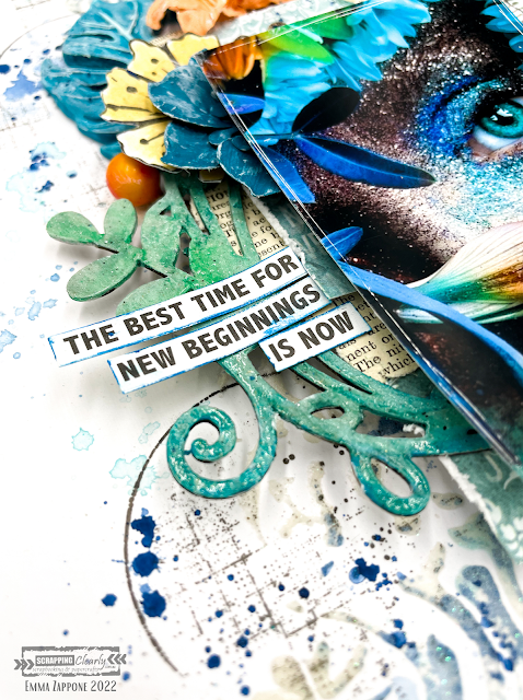
New Beginnings - with Emma Zappone

 Welcome to 2022!!
ScrappingClearly has got some awesome things planned for everyone this year.
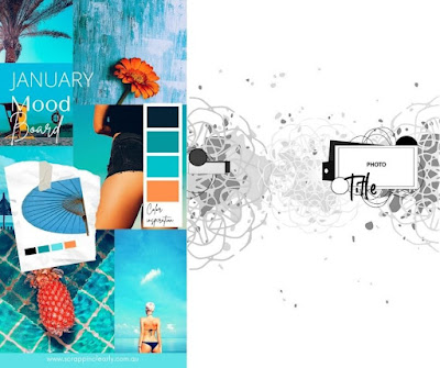
And today I'm sharing with you an A4 layout and a Video that has been created using inspiration from the absolutely awesome NEW mood/sketch for January. The colours scream summer and fun!
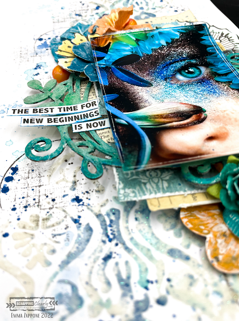
Here is what I was inspired to create......


Here is the mood/sketch...


Super cool right???
I decided to focus on the mood part of this board, and save the sketch for later in the month.

I used lots of products in my stash but also available in the SC shop. Firstly the stencil I used is a Finnabair stencil Oriental wall used with snowflake paste. Soft and glittery which was a great base to start with. Then I smooshed colour. I chose to use 2 colours for the background work. First is an Izink pigment in celestial and then a Distress crayon in Peacock Feathers.
These worked so well in with the paste.


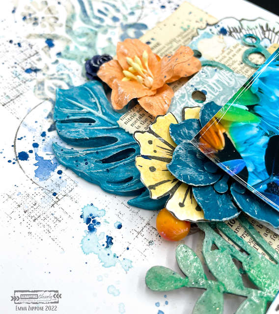
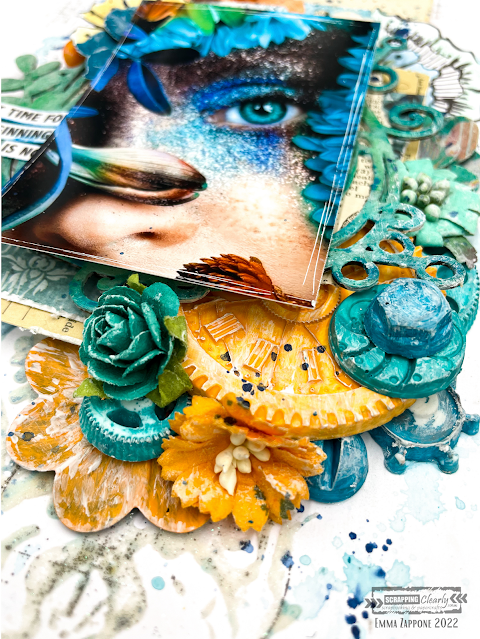
Ok, so I LOVE moulds and this page incorporates plenty. I used a variety of different ones, but love the big palm leaf and of course the machine parts one. These are painted with Dylusion paints in a mix of Squeezed orange & Polished Jade. The metal Finnabair mechanical flowers were primed with white gesso first and then painted with the coloured acrylic also. 


I added a little stamping onto the background to add more layers using the Tim Holtz Glitch1 set. It's grungy but goes with just about everything. I love the texture it brings.


The chipboard frame is one I have in my stash and I primed it with white gesso first and then with complimentary Distress crayons 'coloured' it in. Then sprayed with water and painted out the crayon, which created this cool blended watercolour effect. Then it was clear embossed.


In the video you will see me use a flower stamp by Art by Marlene and then coloured with more Distress crayons and then cut out to help build my layers. I absolutely love the dimension of this layout.
The papers that mat my image are what I have in my stash, and I love adding book paper for that slight reference to vintage style that I love.

I hope you are inspired by this project and the amazing board that is available for you to play with NOW!
I hope you enjoy watching this project coming together too...watch now with a cuppa....


I will see you all very soon.
Stay crafty friends, Emma. xx


Thursday, 26 August 2021

XOXO - With Karyn Schultz!

  Hi Scrapping Clearly Lovelies!

It's Karyn here and today I have a scrapbook page that I created using lots of fun products available at Scrapping Clearly!
 

  I'm playing along with the August moodboard challenge. We would love for you to join in with this challenge and be in the running to win a Scrapping Clearly store voucher. You have until August 31st and you need to upload your challenge here.
 
For my background I started with heavy white cardstock and I added some colour to the page using a painting with plastic technique and Prima watercolour confections - purples from the Classics and Tropicals palates. 
 
  
 I added some stamping using black Archival ink and Bee Arty Stamps.   

  
Next I added stencilling using a Bee Arty Stencil and TCW platinum modelling paste

 
Here is my finished page. I've used a photo of my gorgeous daughter and her boyfriend :)
 
  
I matted my photo with Vicki Boutin Storyteller Mosaic paper and Heidi Swapp Color Magic paper. I embellished with a paper doilie, metal embellishment, paper flowers, chipboard, mini beads, and Tim Holtz Idea-ology small talk stickers. Lastly I drew around the edge of the page using a Fude ball pen


 Thanks so much for stopping by!
 
Crafty Hugs xx


Thursday, 29 July 2021

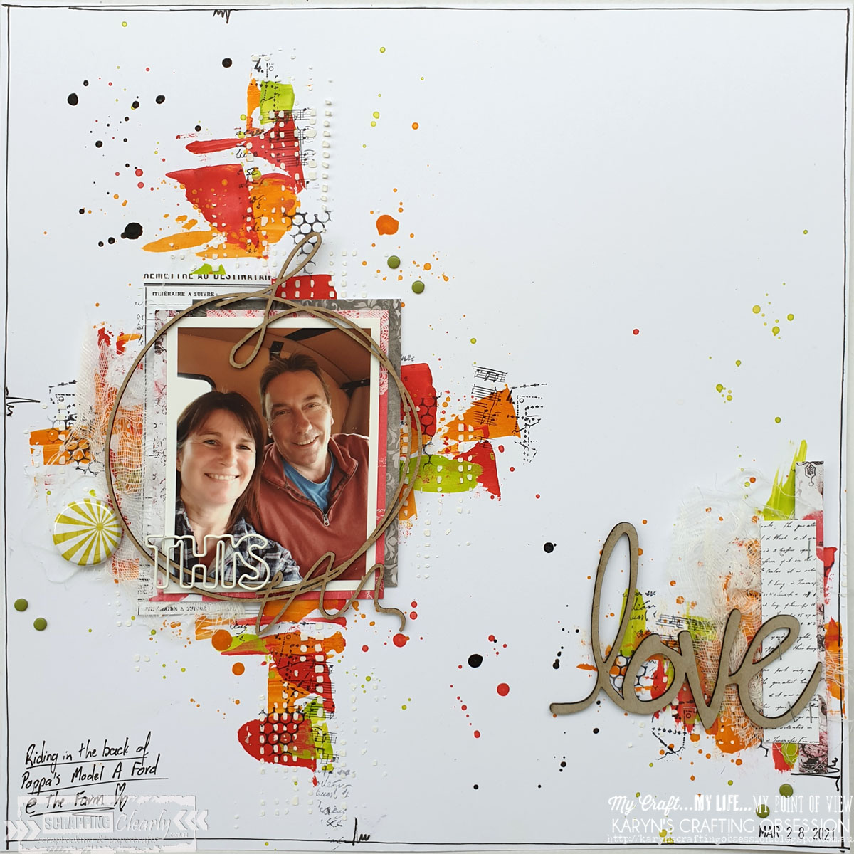
Christmas in July Challenges - With Karyn Schultz!

 Hi Scrapping Clearly Lovelies!

Did you join in on last weekends Christmas in July Cybercrop? Today I have the four scrapbook pages that I created using lots of fun products available at Scrapping Clearly

The first page was for Challenge 1: Traditional Christmas Colours.  

 
I've used a monochromatic red colour scheme on a heavy white cardstock background. I created a watercolour background with Prima watercolour confections, then added stencilling with Nuvo Glimmer paste - Red. My photo is matted on papers from the 13@rts Unforgettable collection.
 
This next page was for Challenge 4: Choose your own Christmas colours.

 
I've used a monochromatic green colour scheme on a heavy white cardstock background. I created a watercolour background with Prima watercolour confections, then added stencilling with Nuvo Glimmer paste - Red. My photo is matted on papers from the Heidi Swapp Old School collection.I've also used Heidi Swapp puffy stickers and words.
 
This next page was for Challenge 4: Christmas colours on a non-Christmas layout

 
On a heavy white cardstock background I've used a palate knife to paint Dylusions shimmer paints in Postbox red, fresh lime, and pure sunshine. Then I added stencilling with white texture paste. My photo is matted on papers from the 13@rts Unforgettable collection.
 
This last page was for Challenge 5: Inspiration Tree

 
On a heavy white cardstock background I've stamped a variety of circle stamps using Tim Holtz Distress Ink ink pads in fossilised amber, kitsch flamingo and broken china. I then added splatters of each of these colours. I added stencilling using Bo Bunny glitter paste. To embellish I used Heidi Swapp words and clear alphas.  

Thanks so much for stopping by!
 
Crafty Hugs xx