Showing posts with label Mood Board. Show all posts

Friday, 5 July 2019

Be Authentic (moodboard inspo) - with Emma

Happy Friday everyone!

Emma here with you all today sharing my take on this months glorious mood board.


And lets refresh our visuals with the mood board......


 It's another stunner isn't it!
I have had this image in my stash for a little while and I knew straight away it suited this board instantly.

I really wanted to be bold with my stencil for this page but still soft to suit the board.
So using a Dina Wakley scribbly faces stencil with Nuvo Mousse in French Rose this came to life.


Then I added a little colour under where the layers were going to be placed, this was created with a few colours but mostly Distress Oxides in Iced Spruce and Tattered Rose. The Jane Davenport build a bouquet stamp around the faces is a DO in Frayed Burlap. I kinda wanted it to look like they had flowers in their hair???


 The tags are a mix of items some from my stash but also a few from Heidi Swapp Journal studio die-cut shapes. I have also cut randomly a bit of the Heidi Swapp 6x6 diecut papers and tucked them into the layers, adding just a little (hopefully) elegance.


The stamp in the background is Carabelle stamp 'peace in the world'. I only inked the sections of the stamp I felt I wanted to show.


And like most of my layouts I added a few quotes and I used Tim Holtz small talk stickers to finish it all off.

Thanks for your time today and I hope you all have an awesome weekend!!

I'll see you all soon, Em xx


Monday, 22 October 2018

Inspired by the Mood Board Part 3 - with DT Katie Howard

Hello and welcome back for the third and final "Inspired by the Mood Board" post! I hope you have been enjoying seeing the many different ways that I take inspiration from a mood board and I also hope that it inspires you to look at them more closely and see all the varied possibilities that they can result in.
Today's post shows yet another different take on the board and a very different result from the previous two creations. First let's look at the mood board again to remind ourselves (in case you have forgotten!):

No automatic alt text available.

This time I took inspiration from the left and centre bottom images, in particular the foliage and flowers in the the forest picture and the frames on the wall in the centre picture. I also decided to go with the light and bright feel of the centre image, and this is the page that I created:


On my page you can see my frame in brown, drawing on the wood in the bedroom and the trees and path in the forest path picture, and then leaves, foliage and flowers from the forest in shades of green and a touch of deep purple/blue.


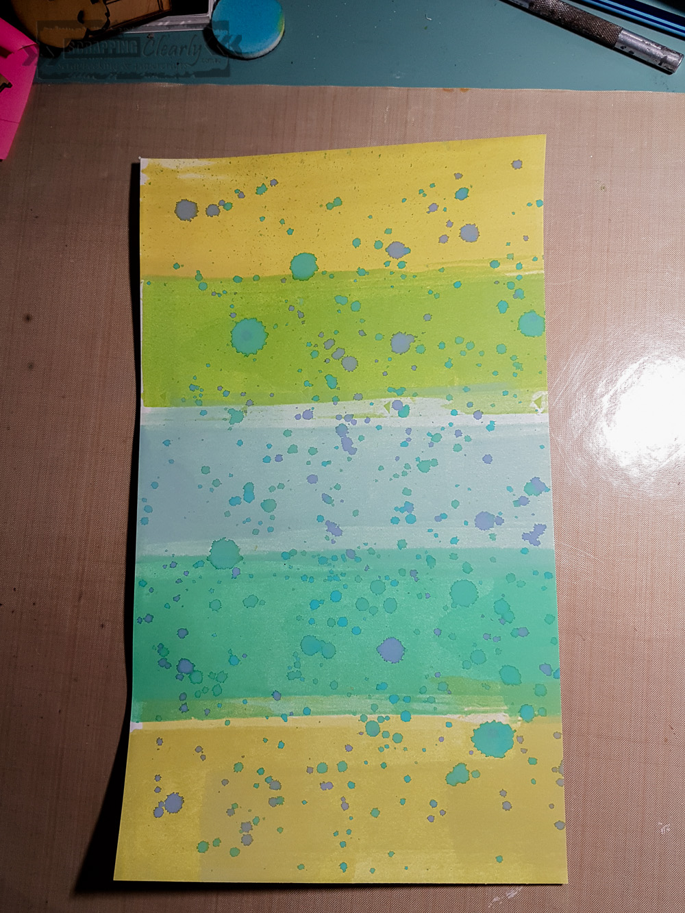
I created my own striped pattern paper using distress oxide inks and a brayer. I added some ink to my craft mat and spritzed some water to create a water colour that I then used the brayer to add to the cardstock. After I made the stripes I added some splatters using some blues and blue green inks to contrast with the shades of green already on the background. The colours that I used were: Evergreen Bough, Peeled Paint, Lucky Clover, Crushed Olive, Mowed Lawn and Peacock Feathers and Faded Jeans for the splatters. To make great splatters grab a largish round brush and pick up some of the water colour ink from your mat and simply splatter!


I decided to add some texture to my background using the Distressed Lace stencil and some white texture paste. The white on white is great for adding texture without adding distraction. To emphasize some of the detail in the pattern I grabbed some gelatos (you could use any water soluble crayon) in pale mint green and a purple and added them directly to parts of my background then used a water brush to move the colour around.

While my background was drying I cut some leaves, foliage, flowers and the frame using my electronic cutting machine and a free cut file from Scrapbook & Cards Today. There are many great free cut files around if you have a look! I used the striped background paper to cut the leaves and foliage from and love how they turned out!

Then it was just a matter of assembling the die-cuts and photos on my page. I used some of the left over striped background to finish my page.


I layered under and over the frame and the photos and didn't stick them completely down so they had more dimension where they curled up.


I finished off with a title from the Crate Paper Maggie Holmes collection Gather, using the word "loved" from the thicker set.

So, there you have it, one mood board and three different interpretations! You still have time to get in an entry for this mood board, check it out on the Facebook Group here, we would love to see your interpretation!

Until next time, thanks for stopping by,
Katie x


Thursday, 27 September 2018

What The! with Emma.

Hi SC Family,
Emma here today sharing a layout that was once again 
inspired by the moodboard for this month.


And here is a reminder of the moodboard....


So this image I found on Pinterest awhile ago and just loved the quirk of the picture.
Plus it reminded me of something my boys would do.

Because of it being blank and white it lends itself to be used with any colour/s.
So yellows it was. (I did sneak in some darker slightly orange shades in there too....shhhh)

I have made a video for this layout that you can watch it all come together.
I started by using a sheet of Cocoa Vanilla Boys Rule collection, good times, which I clear gesso over.


I then began to stamp in the area that I had chosen to create my design.

I used a mix of stamps, but main focus on the Dina Wakley Scribbles set.
Once my stamping was complete I then added colour. Firstly with Dylusions spray in custard and then dylusions acrylic in lemon zest.
You can see how I applied these in my video.

I then cut a couple of 3x4s from the Boys rule fun games sheet, and placed behind my image with a few precut 'tags' I made from some older papers.


My title and a few of the embellishments come from the Boys rule ephermera pack.
Along with some chippy that I inked with a Distress oxide reinker in squeezed lemonade.
Which I then painted over with a Prima opal Magic.


Within the embellishments I also added a couple of metals from the Steampunk gears.
And like most of my pages I finish off with some Liquitex ink in Carbon black. I never tire of this final piece.

I hope you enjoy my video and I will catch you all next month.

Till then, Em. xx


Thursday, 10 May 2018

Together - by Emma.

Hi everyone to this fantastic Thursday!
Today I’m sharing a layout that again was inspired by some Pinterest art. (O my there is so much awesome on Pinterest)
I also sort of kinda played with this months moodboard colours ðŸ˜œ 
So here is my take....


I’ve used lots of SC products. 
For my base I placed white Gesso then over that I started with distress oxide in peeled paint. Smooshing this over the gesso. 
Then I flicked and activated with water some mica powder in green
And with a stencil gold crackle texture paste


Then I stamped and started my layers. 
My layers include sheets from the Pink Paislee memorandum collection and a fabric Heidi Swapp tag  And I used some 2Crafty chipboard painted with Dylusions mushy peas  and black ink


I also spritzed a couple of pieces with Gold and the ‘together’title I sprayed with gold also. 

The resist flowers I rubbed the distress oxide over to compliment the base colour. 


A flower and a few Heidi Swapp marquee love rhinestones and this page is complete. 
But not quite....I had to finish with the flick of liquitex titanium white . 😜 
I hope you have a great Thursday and I will catch you all really soon. 
Em xx


Monday, 2 April 2018

Magical - 12x12 layout


Hi everyone, 

Hope over this long weekend you managed to get some down time in.
I know I’ve been trying to take time out for some creative play. 
So today I share a 12x12 with you. I’ve been doing a lot of other play with art journals etc because I thought I had become boring in my scrapping. 

But after creating a few new 12x12s I realise I just love this process so much.
Yes, sometimes they can look the same and yes, the process can be the same but it doesn’t matter, it’s about having fun, creating for you, and just really enjoying the art for what it is.
I am my own worst critic. 
So with that, I got inspired by this month's challenge . And I love that we have been combining them. 


I was also inspired by this beautiful art work I found on Pinterest. 


I’m not sure of the original source, but I’m in awe, and had to use it. So gorgeous! 

And here is my creation.....


How awesome to have these moodboard colours to suit this photo. 
I started with a sheet of Paper Arts Artistry2 for my background, then I spread a bit of gesso, then through a stencil used Jo Sonja’s Texture paste black and then added my colours over it. I chose Distress Oxide in Fossilized Amber and Wild Honey
Then I needed to balance the yellows with some blue. So I splashed some mist in aqua, and Liquitex paint marker in cobalt blue which I added water to and flicked around. 


Once dry I stamped a few different images around including the Darkroom Door hexagons and Dina Wakley abstract scribbles
Behind my image I used a sheet from this Heidi Swapp 6x8 paper pad  and  one from the Pink Paislee 6x6 Memorandum pad. 


For embellishments I used a few of the arrows from the Heidi Swapp color resist embellishments pack, and a couple of the stickers from the Marquee Love rhinestones pack. 


I finished my page with some of the cool pebble rocks in aqua  mixed with glossy accents  to adhere to the page. These are awesome!! 

This layout is also the sketch flipped on its side. 

I hope you play around with this months challenge, they are always so much fun. 

I’ll catch you all again soon, 
Till then,

Em xxx


Monday, 19 March 2018

Mixing Collections - a scrapbook page with Katie

Good Morning!
How are we all traveling?
Personally, I am finding myself pretty busy doing all sorts of catch up things around the house, cleaning out, rearranging that kind of thing. We ordered ourselves a new lounge in January and we are looking forward to a fresh new look in our room when it finally gets here, but it also means some other "sprucing" up, new rug, move the furniture that kind of thing. Do you get the "need to change things" bug too? It hits me every now and then and my hubby knows it is best to nod, say yes dear and stand back!

Now to scrapping, today I am sharing a page that I created combining bits and pieces from two different Maggie Holmes collections. The great thing about her collections is that they do have some common threads through them making them very easy to mix and match to create a page or several pages! I was also inspired by the current mood board when creating this page. 

 No automatic alt text available.

It was primarily the colours and the flowers that inspired me, because they match Maggie Holmes collections very well, and she loves flowers too, a match made in heaven. This month you can combine the sketch and the mood board into one page, check it out here.


I mostly used the Crate Paper Bloom and Chasing Dreams collections to create this page, but there are many Maggie Holmes collections and you will find that they all work pretty well together!
I used a patterned paper from Chasing Dreams called Moment for my background as it was the perfect colour but also had a distressed look to givesome interest.
Most of my other papers were from the Bloom 6x6 paper pad, yes even the big strips behind the photos! Tucked in behind the photos you would never know they came from a 6x6 paper pad! The glitter piece is from Chasing Dreams and I love how it adds a little bit of gold sparkle without taking away from anything else!


My title word "Love" came from the Heidi Swapp Vintage Chic chipboard stickers and it was the perfect pink to match in with the other colours. The title was layered on other chipboard stickers that came from the Bloom collection, while the black phrase sticker is from Tim Holtz's Idea-Ology range of small talk stickers. These are some of my favourite to use, so easy to add in and a great way to add pops of black too. Don't be afraid to layer your chipboard pieces too, it is the perfect way to add that depth without too much bulk.


I am loving these vintage buttons from the Chasing Dreams range, there are four different colour and styles of buttons and they are great to add to tags and include in embellishment clusters. The rubber charms in the Bloom range are also fun to use and are a great way to add some unique texture too.


Thanks for stopping by,
I hope this inspires you to have a go at
mixing your collections.

Katie x


Friday, 16 February 2018

Our Creative Fans are Fabulous!

Good Morning Arty peeps

Without the crazyness of life and visitors I am stepping in today to share with you
some of our wonderful entries for our monthly challenges.
Our fabulous fans have produced pages sure to spark your creativity.

First up is the sketch

No automatic alt text available.

and these two fantastic entries


By Beverley Arbuckle, I love, love, love the story
and how Bev kept the page simple to show it off fully.


By Jude Willey, her great grunge background makes for
such a cool boy page


And secondly, our mood board
Expressive of the heat of Summer Downunder

No automatic alt text available.

And this amazing page

No automatic alt text available.

By Jude Willey, read here for her story about the
thought process that brought her to this great layout.
She has totally rocked the colour scheme!

There is a $30 shop voucher for each challenge and great odds at winning.
Lots of brand new stock in the shop and on it's way from Creativation 2018.
We would really love for you to come and play with us!

Wishing you a fun and creative weekend.

Monday, 12 February 2018

Art Journal Page using February Mood Board

 Hi There Arty Peeps!

Hope you had a fabulous creative weekend, I know some lucky ladies did at Hunter Valley Retreat.
I should have joined them, feel very much like I missed out.

So I took some time out from family and got to creating at home, in the air-con.
Looking for a kicking off point by browsing one of my art journals, I found this page that
reminded me of the mood board for February.


This is the mood board, and there is $30 shop credit for the winner.
We'd love you to join us by uploading your project here on Facebook.


My page was already started with Dylusions ink sprays in Bubblegum Pink, Pure Sunshine,
and Crushed Grape, with some Clear Crackle in some areas.
I chose an image from a vintage women's magazine, found a quote, and started from there, sticking them down with Matte Medium. I could probably have achieved a better finish (without wrinkles) had I used a brayer.


Needing some black to balance the image I grabbed a Kinder Kreations mandala
and scraped some Black Lava texture paste through it with a palette knife. This stuff has a finish that looks like bitumen with bits of glitter in it. It's great for adding grunge.


To tie together the black mandalas and the picture I added some Liquitex ink dribbles.
This also deliciously highlighted some of the crackle.


I added words to link the title to the picture using Sharpie markers.
Here is my completed page.


I'm loving the hope in the bright colours despite the ambiguous message of the page.
Art journalling, for me, is about getting what's in my head out onto a surface.

Well, that's my mood board challenge for the month.
Looking forward to seeing yours!

Thanks for coming by,