Saturday 31 March 2018

April Combined Challenge

Hello Arty Peeps!

Welcome to our April Challenge.
We are combining our mood board with our sketch again.

Upload your entries here for the chance to win $30 to spend in the amazing


Happy creating!

Wild And Free Canvas Panel by Leonie Neal-Dawson


Hello, I hope you all are relaxing and enjoying this Easter Weekend.

Our family generally goes camping this weekend but this Easter we are staying home so have no particular plans. I am thinking maybe fitting in some crafting will be an option..? What do you do over Easter Weekend?
Today I have this canvas panel to share with you. 

"She was life itself, wild and free. Wonderfully chaotic, a perfectly put together mess."
9x12" Canvas Panel 


I used this paper 'Bright and Beautiful 1' by Paper Arts. I liked the pastel tones to this paper and thought they looked a little 'Easter-ish' and that's probably where my Easter theme ends!
I cut the paper into lots of different sized squares and rectangles and collaged them onto 
a 9x12" canvas panel using Liquitex Matte Medium.


Next up I used a black Stabilo Aquarellable pencil to define each rectangle and smudged out the lines with a wet paint brush. Some stamping and splashes of watered down Gesso finished of the base of my canvas panel. 


My Chipboard title piece Wild and Free is by Memory Maze. I incorporated this into my quote
"She was life itself, wild and free. Wonderfully chaotic, a perfectly put together mess."
Can I let you know, 'Mess' is how I was feeling about my title chipboard after adding layer after layer to it
before I finally settled on something I was happy with. 
Liquitex Gesso came first but looked too plain, then it was black ink but I didn't like that either. Texture Paste and Dylusions sprays next - that blended in with the background too much! I was really beginning to think it was going to end up in the bin until I added a couple of coats of  Dylusions White Linen Spray. This last layer covered the bright dylusions pinks, purples and teal...but still left a faint tinge of them showing through, that and the earlier layer of texture paste finally made me happy. Phew, I was getting worried there for a bit. 


I accentuated my panel with these lovely Prima flowers, I like that they also had some feathers and so  tied in with the Wild and Free theme. 


That's it for me today, I hope you have a lovely Easter Holiday.

Happy Crafting and 
cheers from me. 

Leonie Neal-Dawson


SaveSaveSaveSaveSaveSave

Friday 30 March 2018

Correcting Creative Mishaps with Fresh Eyes - in my Art Journal.

Howdy Bloggers, Lisa here with a Good Friday Mixed media update.


Today I'm sharing with you an Art Journal Page using the new Kinder Kreations Eye stencil.
Sometimes I get stuck and when I am drawing faces the eyes can always be an issue,
 getting balance and size in order. I am definitely no fine artist

There are also those moments when we are not really fussed with the end result 
and have to walk away and come back with fresh eyes to finish it. This is one of those pieces. 

So here is where I started... Check out this quick video


I've started in a small Dylusions journal, randomly smeared some Dylusions and DWM acrylic paint around the page and removed some, while imprinting a DWM stencil detail.

I've added some Gel Plate paper circles that I've grabbed from my mixed paper stash
and introduced marks and details with a black Fude Ball pen, a pink Posca, a correction pen, and stamps.
Out comes the Kinder stencil and upon reflection, I should have reversed the eyes to face into the page,
but it's all a lesson, right?
I applied black acrylic paint through the stencil using a make up sponge.
Added the pink circles and drew the face in with a stabilo and loosely painted it in.

At this point I fussed over the page and wasn't really happy with the overall flow, so I went to bed.

I woke to this page, a little confused about what to do with it,
should I turn the page and forget it?
Or just play with it a little more ?


Scattered within my very messy art table I noticed some
Tim Holtz Halloween rub-ons... and had a little fun with this page.
I love rub-ons!


This was one of the other projects I completed during my weekend.
Oh the Jane Davenport serviettes/napkins are my fave art journal quickie.
So easy to throw together a quick effective piece and it look effortless and beautiful.
I also broke open a Dylusions black page Travel Journal insert. 
So effective on the black background. Do you have a black paged journal?


Thanks for dropping by the Scrapping Clearly blog,
I'll be back next week with a new mixed media update.

Happy Ishtar... Or Happy Easter.
Have a peaceful, safe, creative time.

Lisa xx


Thursday 29 March 2018

Cards From Leftovers - With Karyn Schultz!

Hi Scrapping Clearly Lovelies,

It's Karyn here, 
and today I have some more cards to share with you made with papers from the Bella Bllvd Illustrated Faith Bright and Brave collection and Heidi Swapp Embellishments - all available in the Scrapping Clearly Store.


I started with a sheet of white cardstock and cut 2 card bases to give a final card size of 5 1/2" x 5 1/2". Then I added a mat of Typed paper to the front of each card.

Next I used some feather dies to cut a heap of feather shapes from offcuts from various papers in the Illustrated Faith Bold and Bright collection kit. I used my Big Shot to do this but you could use a Cameo if you have one or you could cut them out by hand. I then layered these feathers over a Heidi Swapp Dreamy glitter paper frame. Lastly I created some rolled paper flowers from more paper offcuts and added these to the cards in addition to a Heidi Swapp bow embellishment.


Thanks so much for stopping by 

Crafty Hugs xx


Wednesday 28 March 2018

Olde Worlde art journal with Em.

Hello hello! 
I hope the month of March has been awesome for you.

So who else is in awe of all the awesome Journal art Lisa, Peg, and Kylie  have been creating? 
Oh my they are such great inspiration, so much so that I had a play in my journal too. 
I have also been playing and teaching myself a little abstract acrylic art. So I tackled it again in my journal. 
With Lisa in my head and the desire to create I made this.....


I think I’ve said it before, but the freedom in art journalling is relaxing and exciting.
You never quite know how it’s going to turn out. 

Once I had layered my base paints which included Dylusions white acrylic and Art Anthology Metal Effects silver, I splashed Liquitex Carbon Black acrylic ink around and at the time thought I had ruined it a little by being to heavy handed with it. 
But this is what is so great about art journalling, you can just keep building. So I splashed Liquitex Titanium White acrylic ink as well then added some Dylusions Squeezed Orange and Ranger Distress Collage Medium into the mix, this ‘softened’ the black splashes a little. 


Next came the stencilling and stamping. 
I used an archival ink through a few different stencils and on various stamps


Once all my ‘messy creative’ was complete, I added to the page with a couple of We R Memory Keepers chipboard frames and, sitting in and around these, I used Tim Holtz paper dolls to add a bit of curiosity to the pages. 


I added to the page a few older stickers I’ve had for years and finished with some more stamping on the frames, and Liquitex splats around it all to pull it together. 


When I started these pages I thought I had totally wrecked it, but the end result makes my heart smile. 

If you have yet to try this form of creativity I highly recommend it. It allows the inner creative out. You might be pleasantly surprised. I know I am. 

I hope I can also inspire you a little with my process video. 


Till I see you all in April....happy scrapping. 

Em. Xx


Tuesday 27 March 2018

Easter Layout - with DT Katie Howard

Good Morning!

Can you believe we are so close to Easter already?
I keep feeling like I have lost some time somewhere, like maybe a month or so! In keeping with it being almost Easter I decided to create an Easter page, and like my last creation, I decided to continue on with the mixing of collections. Mixing collections is such a great way to make your stash go further too, and it doesn't hurt when they all go so well together!

Today I am using two Maggie Holmes collections, Chasing Dreams and Gather. I was also inspired by a page that I saw by Paige Taylor Evans which used lots of paper strips on the background, each of those strips had decorative edges and were grouped by colour. In a similar way I created paper strips, used some border punches to give them decorative edges and put them into a rainbow pattern of colours, and I love how it turned out. This is such a great way to use lots of patterned paper, but in small amounts so it doesn't look too overwhelming.


I started on a piece of white cardstock, then I sorted through my papers from both collections looking for colours and patterns that worked together to form a "kind of" rainbow. A great way to start is with the 12x12 paper pads for Chasing Dreams and Gather, that way you have some of all the beautiful papers at hand. But, buying individual sheets you have the benefit of them being double sided! , I used both sides of most of the papers that I chose, and I only cut strips that were between 3/4 inch and 1.5 inches wide so you really don't use very much at all, leaving so much pretty paper for more pages! That is what I call a win-win situation.
From Chasing Dreams I used: Hello Beautiful, Cheerful, Be Happy, Lovely, Delicate, Stay True and Graceful. And from Gather: You + Me, Kate, Beautiful, Details, Thankful Heart, Magical and Moments.

I layered my photos with some of the Gather ephemera and some more of the patterned papers, just enough to create a separation from the background. I also raised this up on foam for dimension and to add to that separation, foam tape is the easiest way to do this. Before I secured my photos, for some added interest, I sprinkled gold mist over the background. I used Heidi Swapp Color Shine but you could use any brand of mist.


Chipboard shapes from the Gather collection helped me to add little details, best of all they have gold glitter on some of the pieces too!


Because I raised my photo grouping on foam tape I was able to tuck some of the chipboard shapes in underneath without it being bulky or sitting strangely.


To finish off I used the word "sweet" from the Gather Thicker accents as my title, the word worked with the Easter Egg theme and I had lots of colour on my page so it didn't clash, all round I was winning! My journalling was typed on the computer and printed, then cut into strips to add to my page. I love doing my journalling this way (if I don't write directly on the page of course), it is such a quick and easy way to add neat and contained journalling. I like to use a typewriter font and I keep my strips pretty narrow.

Well, that is my page for today, I hope it inspires you to go and play with and mix collections or maybe try creating a background with strips of patterned paper, or even just to scrap an Easter page!
Thanks for stopping by, until next time...

Katie x


Monday 26 March 2018

What About Your Happy Face...

Hey, and hello, and happy Monday scrappy friends!!

Today I am playing along with the March challenges. Well, the March challenge, both have been rolled into one which was a bit different and fun!


Here is my take


And here is my process video over on the ScrappingClearly YT channel.

As I'm certain you noticed, I ended up flipping the page and am really happy with my end result. 

Again, I've started with one of those super cool Ella & Viv papers, "Cardinal and Gold" to be precise, and built my layout on top of that. I chose that paper because it included almost all of the colours from the mood board - the only colours missing were the pink and green but I ticked both of those boxes, one with messy mixed media and the other with, of course my Minc ;)


I've used some Dylusions acrylic paint in Polished Jade with my silicone brush to apply my first messy layer on the background, sticking fairly closely to the sketch.


In line with the sketch my next layer was some watered down black gesso. I found a cool little dropper tool that had been buried in my stash but you could very easily use a big paint brush or a pipette to get the same effect by splattering from high above the page.


I added some pink as a mat under my 3 photos using some of the Heidi Swapp Minc cardstock. I've added more pink using some of the Heidi Swapp pink foil on the title - using the Minc Alpha Stickers - and the subtitle - using one of the Jumbo Words.


With the background being so bright, colourful and busy I didn't feel like I needed to add much more so I added my journalling, which I typed up in strips, and 2 of the Heidi Swapp Sequin Shapes - Disco Arrows and one of the Cocoa Vanilla Studios You Rock Rubber Charm pieces.

I have added 2 dates on this page - firstly the date the photos were taken, and secondly the date the page was made/journalling done. I think I will pop this in his current album so the journalling continues in chronological order.

Make sure you play along with our challenge this month for your chance to win a store voucher. Head over here to the FB page to upload your entry to the correct album. I can't wait to see how you interpret this month's 2-in-1 challenge!!

Until next time, happy scrapping!!

Melinda


Sunday 25 March 2018

Letters to My Daughters - Art Journalling with Feeling

Hi everyone
Marelle back again!

I have an art journal/"Letters to my Daughters" book and haven't added much to it lately - so I have promised myself I will add to it each month!

I altered a visual artist diary a few years ago and I write letters to my Daughters - sometimes it's the funny quotes they said as little girls, sometimes it is what I love about them right now, each page has a different story and is special to me.. ... I hope it will be special to my Daughters in years to come.

Here is a picture of what the book looks like and an example of some of the pages.

I used paint and texture paste through a Tim Holtz stencil to create the front and back covers.

I coloured gauze a little darker than the cover colour and attached metal embellishments : Journey : Strength : Knowledge.


The back cover


I love that Art Journalling does not have to be perfect - and also that Mia and Ella will have this memento of all the interesting and funny stories of love handwritten by me.

For this next double page in my Letters to my Daughters journal I used the gorgeous Vicki Boutin acrylic paint set from the shop - in this set are the colours: Orange Slice, Cotton Candy, Crushed Pineapple and Cherry Bomb. I wiped a small amount of each of these colours over the page using an old credit card. I allowed these pages to dry and started creating a background for my letters.

I keep discovering new paints in our shop - these are delicious and blend well! Another "must have" in your stash!

Next I used the gorgeous daisy Ken Oliver stamp randomly over the pages. Ken's stamps are so detailed and stamp beautifully. 


Here is the letter I wrote today as my Daughter was embarking on Year 10 at Senior School (1hr 15 away) after spending 10 years Prep - Yr9 at our local campus which is small and rural.


I hope you have enjoyed this small peek into my "Letters to my Daughters" Journal.

Happy crafting

Love
Marellex


Saturday 24 March 2018

Cathartic Art Journalling

G'Day Arty Peeps.

I hope you are making time for creativity in your days.
Along with Kylie and Lisa, I have been spending a short time each day playing in my art journal, for sanity's sake.
It is a bit like meditation but with eyes open and hands busy. An opportunity for me to pour out
the emotions in my head onto a surface.

This first page was started with Dylusions paints and a Crafter's Workshop stencil, dried and overlaid in some places with washi tapes - striped and newsprint.
It became one of those pages that just keeps growing, layer upon layer because you're not really happy with it and don't have any idea where you're going with it.
So, I decided to try to paint a simple black and white image on top, a profile of a woman's face leaning her forehead on her hand. Unable to get it to look how I liked, I covered it too with paints and stencils,
a little more transparently this time.

Then I had a lightbulb moment and reached for my Lion head stencil, made with my Silhouhette,
and some white Dylusions ink spray. I scribbled over the stencil outline with a black pen.
It was only left to stamp on the page what was going through my head.
These alpha stamps are an old Hero Arts set (I think) but you can find more current sets here.
I used Archival ink for the stamping and a bit over and around the page.


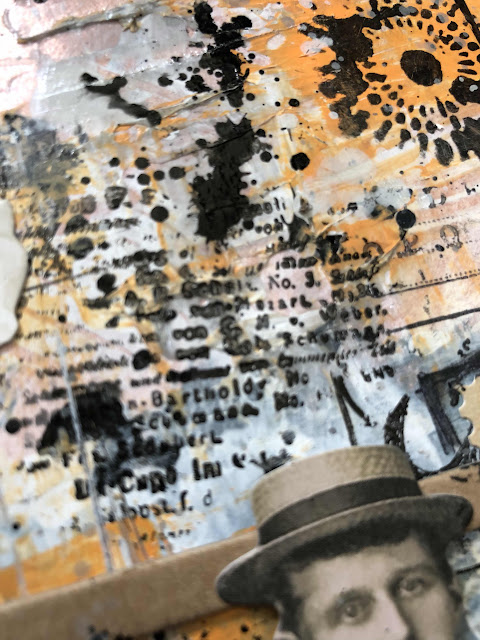
After the first, kind of emotional, page I felt free enough in my head to play without my inner critic going off. I grabbed whatever was close, starting with black gesso, and a magazine face applied with Matte Medium.

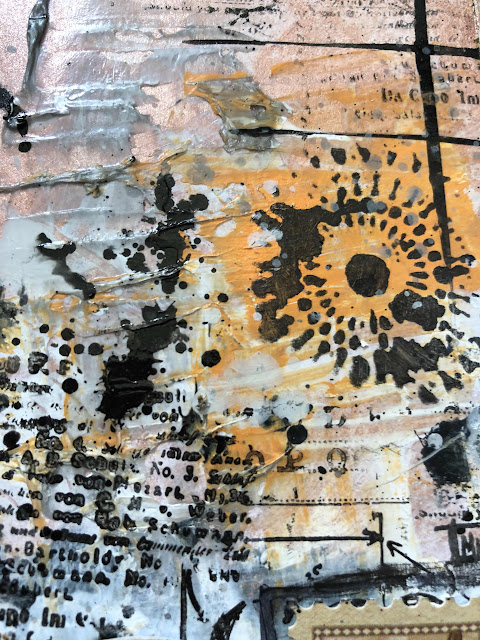
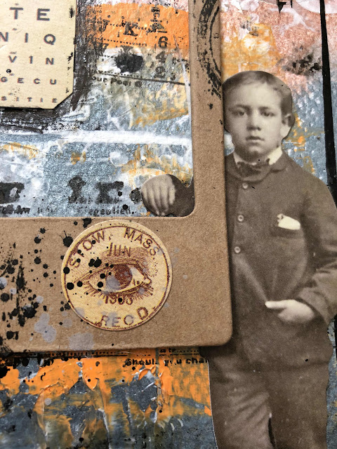
Looking through my stash of collage materials I came across some ancient sticky felt ribbon (omg, remember these?!) and these fantastic pages pinched from my mate Lisa's awesome murder book (Thank you Lisa, eternally grateful xx). The title worked for me, but I also wanted to include the story, well, because it's dark, creepy, and entertaining.

So, adding the felt to the right side, I balanced it with some starburst stencilling.
I smothered the lady's head in Dylusions paints, it was supposed to look like flowers but I gave up on that idea, and stuck down my gruesome story, again using Matte Medium.

To brighten the page I added pink paint. Then lastly, swiped the edges and across some bits of the page with black Archival ink and added black drips.

This page was quick, messy, and fun. Just the way I like it.


I recommend you get yourself an art journal if you don't already have one, they really are cathartic, and a great place to explore with different mediums and practise your techniques.

Remember you still have a week to join in our challenge this month,
we love seeing your projects, and you could win $30 to spend in the shop.
Jason took this video of the amazing shop, check it out!!


Thanks for coming by,
til next time,