
Hello Leonie here today.
Do you love Kraft Cardstock? Use it sometimes? or Never touch the stuff?
Today I'm sharing a scrapbook page based on Kraft Cardstock.
But first....
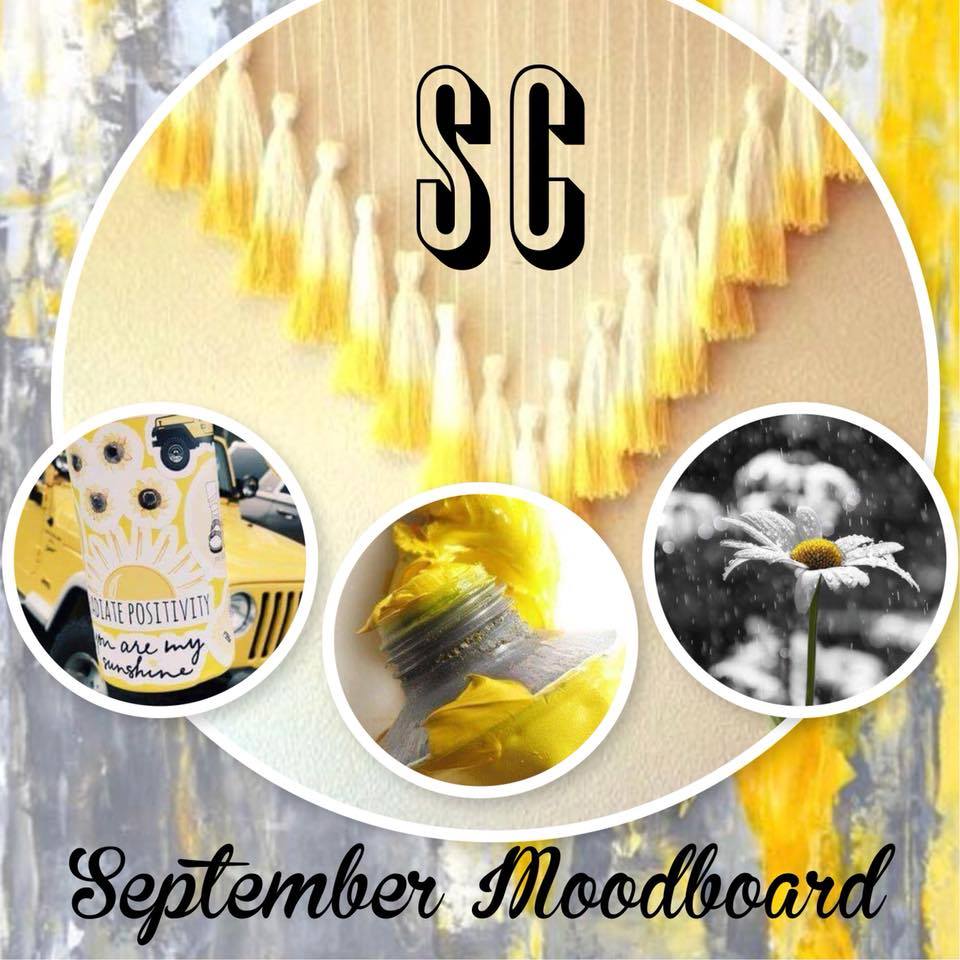
How are you going with our September moodboard challenge?
A reminder that entries are due end of the month and you can load your take on this sunny board into the Scrapping Clearly Share and Inspire FACEBOOK ALBUM.
Ok back to the Kraft issue.
I know we/I often go straight for white cardstock as a base for my pages but Kraft, I think, is often underrated. I find there are certain things that go so well with Kraft that I really should consider it more when choosing a background.
I wanted to use the papers from the Heidi Swapp Wanderlust 5x7" paperpad for these
photos of a girly night on the town and I thought a Kraft
Cardstock base would suit them perfectly.
There are some lovely Neutral tones and Kraft patterns in the Wanderlust range so a Kraft cardstock base made sense.

I added some Cracked Pistachio Distress Oxide ink splatters to the Kraft.
I really like the opaque/milky look of the Oxide inks on the Kraft paper.
Just something a little different to the effect of oxides on a white base.
I found the colours in Dina Wakley's Media Washi Tape suited my colour scheme so I've added some strips under the Heidi Swapp Wanderlust Papers.

White always looks so good on Kraft Cardstock it's just one of those classic combos that looks perfect no matter what.
So I added the 'Simply' Heidi Swap Acetate word in white and some doodling to my page with a white gel pen.

Some Studio Calico Heart Stickers complimented my background so they found their way to embellishing my page.

Thanks for stopping by today.
I hope I may have tempted you to try a Kraft base to your next scrappy page?
Happy Crafting
Leonie Neal-Dawson
I hope I may have tempted you to try a Kraft base to your next scrappy page?
Happy Crafting
Leonie Neal-Dawson

No comments:
Post a Comment